

Table of contents
Flexbox is a powerful and dynamic one-dimensional layout creation way. Flexbox can help us to make layouts responsive and it allows us to play around with spacing between the elements inside the flexbox container.*
Flexbox Terminologies
Main Axis: -> Main axis is also known as a primary axis in flexbox. The main axis is controlled using the flex-direction property. By default, it is laid out in a horizontal direction. It can be changed in the vertical direction by making the flex-direction property to the column. So, that we can lay out elements from top to bottom.
Cross Axis: -> Cross axis is a perpendicular axis to the main/primary axis. Its direction is purely derived from the direction of the main axis.
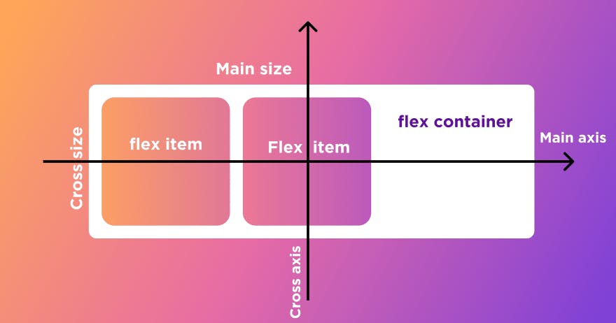
- Flexbox Container & Flex Items: -> : Flexbox basically works on the container and children elements. That is we make a parent element as a flex container and everything that is wrapped inside this parent element becomes the flex items.
In the above example, we can see that we have made a div with container class as display flex. Now this will work as a flexbox container. Whereas, the divs with box class will act as flex-items.
Flexbox Properties
Flexbox properties can be divided into two categories.
- Container Properties that can be applied on Flex Container.
- Properties that can be applied on flex items.
Container Properties.
Display: This is the main property that is mandatory on a flex container with the value of display: flex. So, we can an element as a flex container.
flex-direction: Flex direction property allows us to control the direction of the flexbox on its main axis. It has the following Values.
a. flex-direction: row :-> It is the default value of direction and it places the flex items from left to right on the screen.
b. flex-direction: column: -> It will change the main axis of the flex container from horizontal to vertical and the flex items will appear from top to bottom.
c. flex-direction: row-reverse: -> It will lay items from right to left on the horizontal axis.
d. flex-direction: column-reverse: -> It will place flex items on the cross-axis in reverse order.
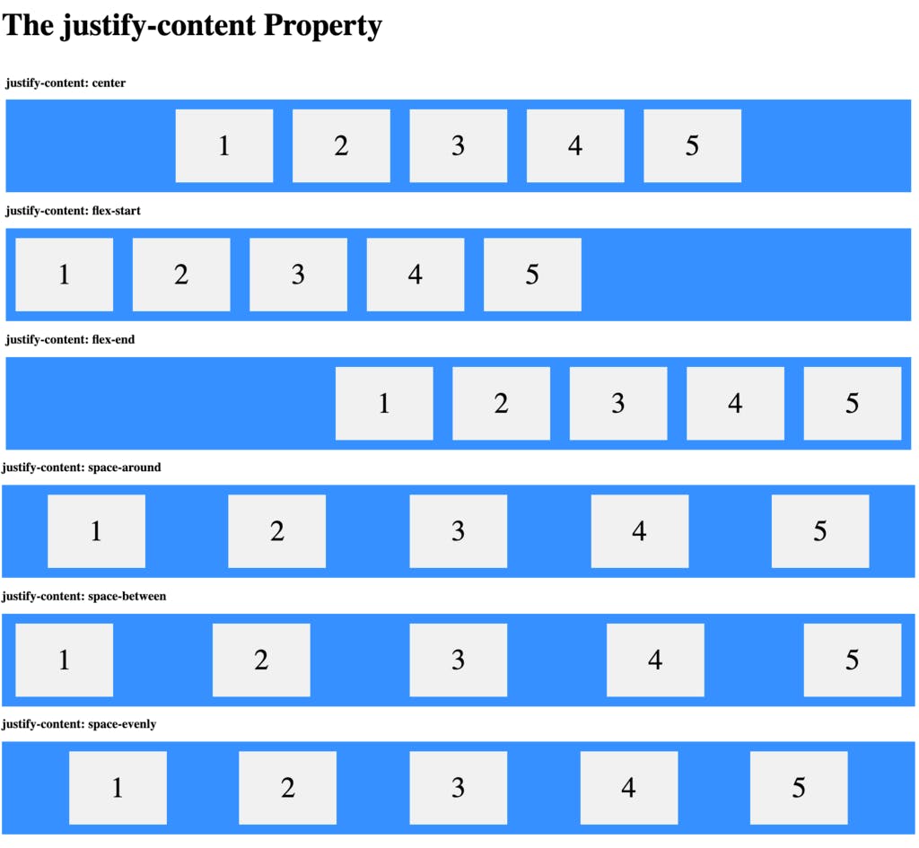
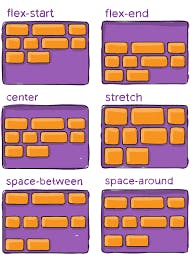
- justify-content:-> Justify content property is used to distribute space of flex items with respect to each other. And it is used to play around with space on the horizontal axis.
It has the following values available in justify-content.
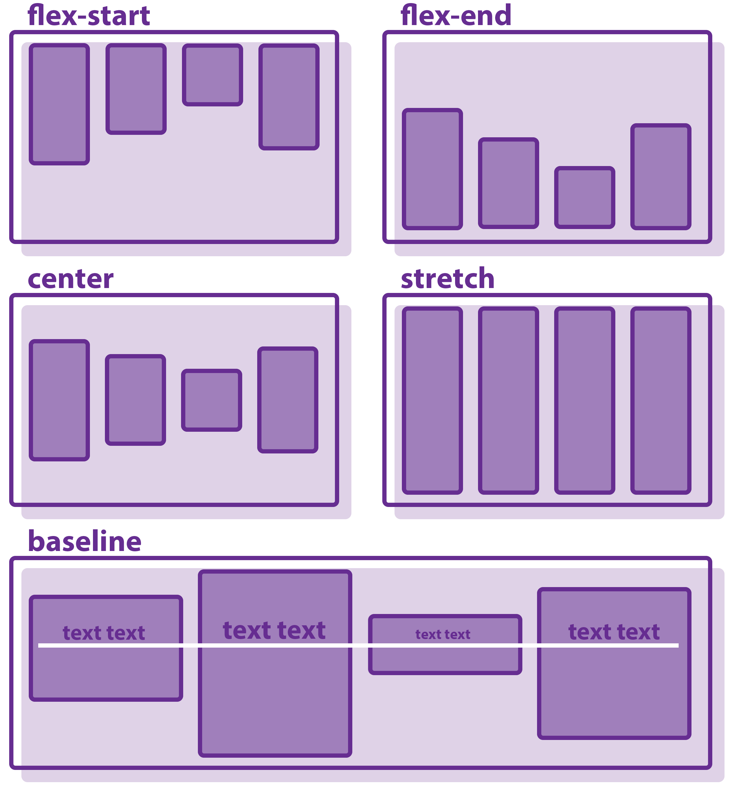
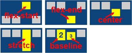
- align-items: -> This property align-items on the cross-axis. It has the following values available.
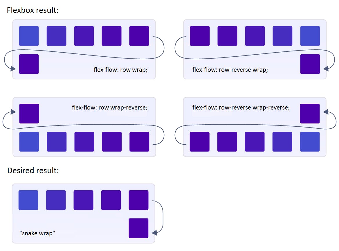
- flex-wrap: -> Flexbox tries to accommodate all the flex items in one line by default. In case we want them to flow on the new line when there is not much space then we can use the flex-wrap property. flex-wrap has 3 values that are as follows
- flex-flow: -> This property is shorthand and combined property for flex-direction and flex-wrap properties.
.flex-container: {
  flex-flow: column wrap;
}
- align-content: -> This is useful to distribute space between lines of flex-items this takes place when there is extra space between lines of flex-items that happens when we wrap flex items and the flex-items take place in multiple lines.
gap | row-gap | column-gap: Gap property is used to add space between flex items. It is shorthand for row-gap and column-gap and it adds space between flex-items on the main axis and cross axis.
flex-basis: -> Flex basis property is applied on the flex-items. It provides default sizing to the flex item before the remaining space is distributed between flex items.
flex-grow: -> flex-grow accepts the numerical values and it allows the flex item to grow x times as compared to other flex items in the available space.
.flex-items {
    flex-grow: 2;
}
- flex-shrink: -> flex-shrink allows the flex-item to shrink more than other flex-items when it is necessary to do so.
.flex-shrink {
  flex-shrink: 1;
}
- align-self: -> align-self property allows the flex-item to align itself separately from the other flex-items.
.item {
  align-self: auto | flex-start | flex-end | center | baseline | stretch;
}
Thank you, I hope it was helpful article for you :)
Learn and Grow together. Keep Learning 🙇🏻 ❤️